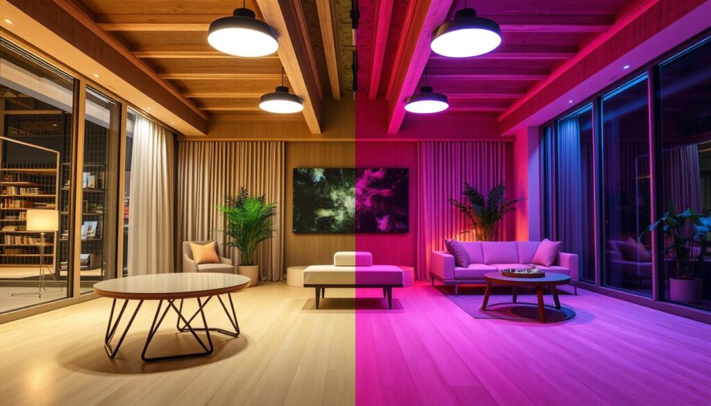
Have you ever noticed that some lights make things look brighter and more real, while others make them look dull or off? Two important lighting factors are CRI (Color Rendering Index) and Color Temperature.
CRI tells you how well a light source shows the real colors of things, like sunlight does. Color temperature, on the other hand, lets us know if the light is warm or cool.
It’s important to know the difference between CRI and color temperature. It helps you choose the best lighting for homes, businesses, and factories.
Key Takeaways
- CRI tells you how accurate the colors are when they are lit up.
- Color temperature tells you how warm or cool the light is.
- When picking the right lights, both CRI and color temperature are important.
- Different places need different choices for CRI and color temperature.
- Understanding these ideas can make lighting better and easier to use.
Light Quality Measurements
It’s important to know how to measure the quality of light in order to make smart lighting choices. It affects how a place feels, how people use it, and how happy they are there.
The Significance of Light Quality in Everyday Life
The quality of light is very important to us. It has an effect on our health, mood, and productivity. Good lighting makes us more comfortable, helps our eyes, and can even change the way our bodies work.
Good lighting makes colors stand out in places like museums, art galleries, and stores. This is because the Color Rendering Index (CRI) is high.
The quality of the light in our homes affects how we relax and sleep. We feel cozy when the lights are warm white and have a lower color temperature. Cool white lights, which have a higher color temperature, are better for places like kitchens and home offices.
A look at how to measure light
CRI and Color Temperature are used to check the quality of the light. CRI shows how well a light can show colors that look like natural light. Colors look more real when the CRI is higher. The color temperature, measured in Kelvin (K), tells us if the light is warm or cool.
- CRI: Checks how accurate and well colors are rendered.
- Color Temperature: Tells you how warm or cool the light is.
- Lumen Output: This tells you how much visible light is being given off.
Knowing these numbers will help you choose the right lighting. It makes sure the light looks good and works well in the room.
What is Color Rendering Index (CRI)?
The Color Rendering Index (CRI) tells you how well a light source shows colors. It looks at how the light changes the colors of things, like the sun does.
Definition and Main Idea
CRI tells you how well a light source shows colors. A high CRI means that the light shows colors well, like sunlight. This is important in places where colors are very important, like stores and art galleries.
When colors are accurate, a place feels real and welcoming. For example, good lighting in a store makes clothes look brighter and more like their true color, which makes shopping more fun.
What the CRI Scale Means
The CRI scale ranges from 0 to 100. More numbers mean better color showing. A CRI of 100 is perfect, just like natural light. When the score is low, colors look dull or wrong.
“A light source with a high CRI is like having a window to the outside world, bringing in the vibrancy and accuracy of natural daylight.”
The CRI of most lights is between 80 and 100. A score of 90 or higher is great for tasks that need exact color.
How to Figure Out and Measure CRI
To find CRI, you compare the colors of the test under the light to the colors of natural daylight. The CRI score is the average of all these comparisons.
It’s important to remember that CRI isn’t perfect. It doesn’t show how well it handles very bright colors.
What is Color Temperature?
In lighting design, color temperature, which is measured in Kelvin, is very important. It changes how a space looks and works. It shows the color of the light, with blue being the color of higher temperatures and red being the color of lower temperatures.
Definition and the Kelvin Scale
A black body radiator is what the color temperature definition is based on. As this radiator gets hotter, it gives off light. In Kelvin (K), the temperature is measured.
The Kelvin scale ranges from low (warm, yellowish light) to high (cool, bluish light). For instance, incandescent bulbs are about 2800K. The temperature of daylight is between 5500K and 6500K.
Light that is warm vs. cool
Color temperature determines whether lighting is warm white or cool white. Light that is warm white and less than 3000K is cozy and relaxing. It’s great for hotels and homes.
White light that is cool and above 3500K gives you energy. People use it to do things in offices, schools, and stores.
Color Temperature Correlation (CCT)
CCT, or correlated color temperature, tells you the color temperature of lights that don’t have a black body. This includes both fluorescent and LED lights. CCT is important for creating the right mood and function in different places.
To design good lighting, you need to know about color temperature. It helps to know the Kelvin scale and how warm and cool light are different. It also helps with the Correlated Color Temperature. This lets people choose the best lighting for their room.
Color Rendering Index vs Color Temperature
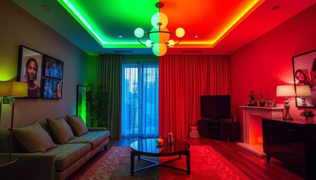
Color Rendering Index (CRI) and Color Temperature are two important parts of lighting. Color Temperature tells us what color the light is, and CRI tells us how well it shows colors. It’s important to know the difference between these in order to make good lighting choices.
Important Differences and Connections
Color Temperature and CRI measure different things. Color Temperature tells us what color the light is, and CRI tells us how well it shows colors. Color Temperature tells us if the light is warm or cool, and a high CRI means the colors are more accurate.
Color Temperature and CRI work together even though they measure different things. A light with a high CRI and the right color temperature can improve the look and feel of a room.
Things People Get Wrong
A lot of people think that a light with a high CRI looks natural. But the color temperature is also important. For instance, a light with a high CRI but a cool color temperature might not be good for reading.
Another mistake is believing that Color Temperature alone determines whether a light is suitable for a task. CRI is also important, especially when color accuracy is important.
When Every Measurement Counts Most
Color accuracy is very important in places like art galleries and photography studios, so CRI is very important. Setting the mood is more important with color temperature, like in homes or hotels.
In short, lighting needs both CRI and color temperature. Knowing how they are different helps you pick the right light for each need.
How to Read and Interpret CRI Charts
CRI charts show in great detail how well a light source shows colors. They are important for figuring out how well a light source can show the real colors of things.
Getting to know the R Values
The R values on CRI charts show how well different colors show up. Each color has its own R value, from R1 to R15. R1-R8 help you figure out the overall CRI score. R9-R15 gives more information about colors like red, green, and skin tones.
- R1-R8: General color rendering index
- R9-R15: Special colors like red, green, and skin tones
What makes CRI (R9-R15) special?
In places where color rendering is important, special CRI values (R9-R15) are very important. For instance, R9 is important for showing red colors well, which is very important in stores and art galleries. R15 is also important for skin tones that look natural.
Standard CRI Measurements’ Limitations
CRI is helpful, but it has its limits. Standard CRI doesn’t take into account all aspects of color rendering, such as colors that are too bright. It also doesn’t tell us what color the light source is.
- CRI doesn’t show how saturated colors really look.
- It doesn’t say anything about the color temperature.
Decoding Color Temperature Charts and Scales
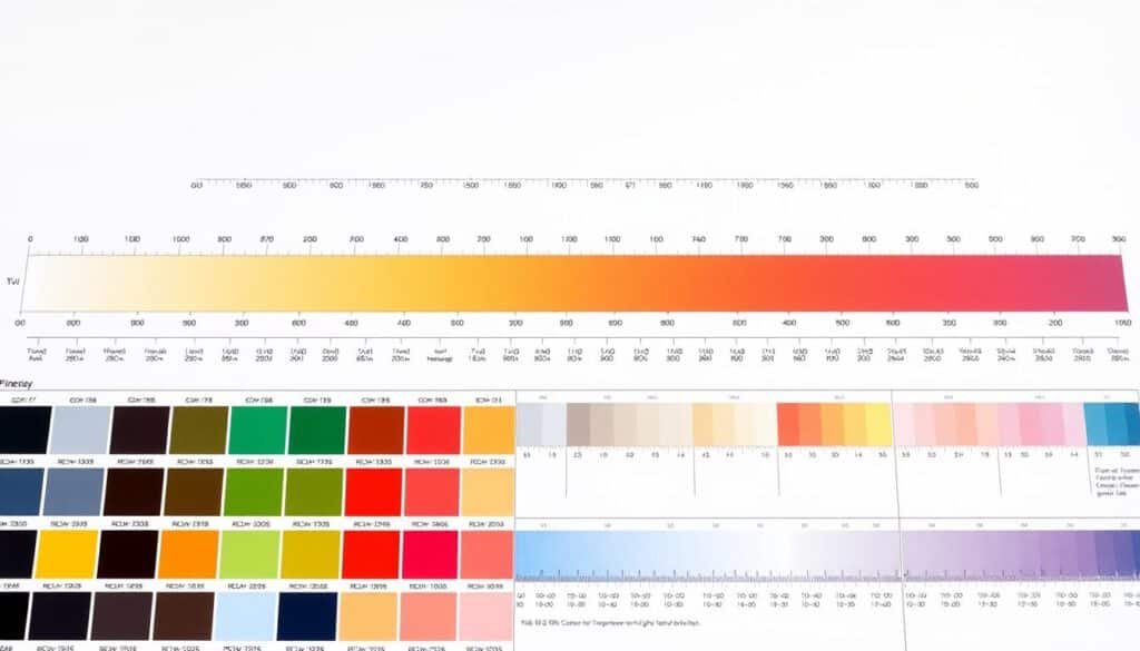
To make smart lighting choices, you need to know how to read color temperature charts. These charts help us choose the best light for each room. This makes sure that the lighting is just right for the area.
How the Kelvin Scale Works
The Kelvin scale shows how warm or cool a color is. It shows what light looks like. For instance, a Kelvin number between 2700K and 3000K means warm, yellowish light. Cool, bluish light comes from higher numbers (5000K–6500K).
Different colors of temperatures look different
Different color temperatures look different. Warm light (lower Kelvin) makes rooms feel cozy, which is great for homes. Cool light (higher Kelvin) gives you energy, which makes it great for places like kitchens and offices.
| Color Temperature (K) | Appearance | Typical Use |
|---|---|---|
| 2700K-3000K | Warm, yellowish | Residential, cozy areas |
| 3500K-4100K | Neutral, white | Offices, reading areas |
| 5000K-6500K | Cool, bluish | Kitchens, task areas |
Using Color Temperature Charts to Choose
It’s important to use color temperature charts to choose the right light. They help match the light to how the space is used, which makes it look and work better.
“Choosing color temperature is important for ambiance and function,” says the Illuminating Engineering Society. It shows that choosing the right light is important for each room’s needs.
CRI Ratings in Different Light Sources
It’s important to know the Color Rendering Index (CRI) of different lights. CRI shows how well a light makes colors look like they do in natural light. Each type of light has its own CRI, which affects how well it shows colors.
Lighting with incandescent and halogen bulbs
Halogen and incandescent bulbs usually have high CRI ratings, often 100. They get their light by heating a filament, which makes colors look real. Because of this, they are great for places that need exact color, like art galleries.
Lighting with CFLs and fluorescent lights
The CRI ratings for fluorescent and CFL lights are different. Most of them are between 60 and 80, but some are over 90. CFLs are similar, but they may not be the best choice for every color need.
Different CRI Levels for LED Lights
People know that LEDs use less energy and last a long time. But their CRI ratings can be very different. Basic LEDs can have 60 to 70 LEDs, but high-end ones can have 90 or more. This depends on the phosphor that was used to make the light spectrum wider.
The Reference Standard is Natural Daylight
CRI ratings compare colors to natural daylight, which is the best light for colors. It has a CRI score of 100. Throughout the day, the colors of daylight change from warm to cool. For tasks that need to be color-accurate, lighting makers try to match the CRI of daylight.
| Light Source | Typical CRI Rating |
|---|---|
| Incandescent | 100 |
| Halogen | 100 |
| Fluorescent | 60-80 (up to 90+ for high-quality) |
| CFL | 60-80 |
| LED (Basic) | 60-70 |
| LED (High-Quality) | 90+ |
| Natural Daylight | 100 |
In conclusion, CRI ratings help you pick the right light for your needs. The right CRI makes a big difference in the quality of light, whether it’s for home, work, or special tasks.
Color Temperature Variations Across Light Sources

Different lights can change the color temperature a lot. It changes the way we see and feel the things around us. This change is very important for setting the mood, function, and look of a space.
The Warmth of Incandescent and Halogen Lights
The colors of incandescent and halogen lights are warm, between 2800K and 3000K. This light makes rooms feel warm and inviting. It’s great for houses.
- The light from incandescent bulbs is warm and yellow.
- Halogen bulbs are a little brighter and whiter than regular light bulbs.
The adaptability of fluorescent and CFL lighting
Fluorescent and CFL lights come in a lot of different colors, from warm to cool. They work well in a lot of places, like homes, stores, and offices.
Some important choices are:
- For cozy places, use warm white (2700K-3000K).
- Use cool white (3500K-4100K) in places where you need to pay attention.
- Daylight (5000K–6500K) for places where you need to pay close attention.
The range of LED color temperatures
LED lights come in a lot of different colors and are very flexible. This lets you change the mood of the room from warm and calm to cool and lively.
You can group LED color temperatures into:
- For a cozy feel, use warm white LEDs (2700K–3000K).
- Neutral white LEDs (3000K-3500K) for lighting that is even.
- Cool white LEDs (3500K–5000K) give off a bright, energizing light.
Natural Light All Day
The color temperature of natural light changes all day. In the morning and evening, it is warm, but in the middle of the day, it is cool. This change has an effect on our bodies and how we feel.
- The morning light is warm and golden.
- Light at noon: cool, bright white.
- Light in the evening: warm and soft.
Practical Applications: Choosing Lights for Specific Needs
There are different lighting options for different uses. Every place needs its own kind of light. These needs depend on the tasks, the mood, and how comfortable the visuals are.
Suggestions for Lighting in the Home
Lighting in homes should be warm and inviting. For living rooms, a color temperature of 2700K to 3000K is best. It makes the room feel warm and inviting.
A higher CRI (90+) is important in kitchens. It helps you see colors correctly for work.
Business and Retail Settings
Lighting in stores and businesses needs to be energizing. Cool white (3500K–5000K) makes you more alert. Lighting with a high CRI makes products look their best, which can boost sales.
| Environment | Recommended CRI | Recommended Color Temperature |
|---|---|---|
| Residential | 80+ | 2700K-3000K |
| Commercial/Retail | 90+ | 3500K-5000K |
| Photography/Videography | 95+ | 5600K |
| Art Displays/Museums | 95+ | 3000K-5000K |
Lighting for photography and videography
High CRI lighting is necessary for taking pictures and videos. It accurately captures colors and details. A color temperature of 5600K looks like daylight and gives off a neutral white light.
Museums and Art Displays
Lighting in art galleries and museums must draw attention to the art without damaging it. Lighting with a high CRI (95+) shows art in its true colors. Depending on the artwork and the effect you want, the color temperature (3000K–5000K) changes.
Knowing how much light different places need can help you make better choices. These options make things work better and look better.
The Psychological and Physiological Effects of Light Quality
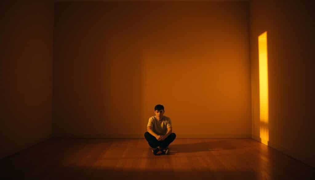
The light around us has a big effect on how we feel and how healthy we are. It doesn’t just help us see; it also affects our mood and energy. The kind of light we’re in can make us feel more or less comfortable and productive.
Effect on Mood and Productivity
The quality of light has a big effect on our mood and work. Cool, bright light wakes us up and helps us work better. We feel relaxed in warm, dim light, which is great for unwinding.
Experts say that the right light can change how we feel and act. LED lights that look like daylight can help you feel better and stay focused.
Color Temperature and Daily Rhythms
The color temperature of light affects our body clocks. During the day, blue light keeps us awake. Our bodies know it’s time to sleep when the light turns red and warm at night.
Knowing how color temperature affects our body clocks helps us choose better lighting for our rooms. This can help you sleep better and be healthier.
Eye strain and visual comfort
For your eyes to feel good, the light has to be good. Bad light can make your eyes tired, which is a big problem when you need to read or work on the computer. The right light for the job makes your eyes less tired and more comfortable.
It also helps to use lights with a high Color Rendering Index (CRI). They show colors more naturally, which makes them easier on the eyes.
Advanced Considerations: CRI 80 vs CRI 90+
When deciding between CRI 80 and CRI 90+ lighting, you should think about how accurate the colors are and how much they cost. A higher CRI means that colors are more accurate. But whether you need CRI 90+ or CRI 80 depends on what you need.
Is a higher CRI always better?
A higher CRI means that colors are shown more accurately. But CRI 90+ isn’t always better than CRI 80. It all depends on what you need.
CRI 90+ is best for jobs that need exact colors, like graphic design. But CRI 80 might be enough for everyday lighting.
Important uses where a higher CRI is helpful:
- Museums and art galleries
- Studios for graphic design and photography
- Fashion stores
Cost-Benefit Analysis
The price of CRI 80 and CRI 90+ lights is not the same. The CRI 90+ costs more because it has more advanced technology. You should think about whether the extra cost for better color accuracy is worth it for you.
Things to think about when doing a cost-benefit analysis:
- The first cost of the lights
- Long-term savings and energy efficiency
- Effect on sales or productivity
Requirements for a Specific Industry
Different industries need different CRIs. For color accuracy, retail and art need a high CRI. But in factories, light and energy might be more important than color.
Recommendations for CRI in specific industries:
| Industry | Recommended CRI |
|---|---|
| Retail | CRI 90+ |
| Industrial | CRI 80 |
| Art Galleries | CRI 95+ |
How to Select Light Bulbs Based on Both CRI and CRI

Finding the right balance is the key to choosing the right light bulbs. You should think about the Color Rendering Index (CRI) and the Color Temperature. CRI tells you how well colors look in the light. The color temperature of the light changes how it feels, making it feel warm or cool.
Reading the packaging for light bulbs
It’s important to read the packaging when you buy light bulbs. Check the numbers for CRI and color temperature. A high CRI (90+) is best for things like reading or cooking. Color Temperature is measured in Kelvin (K) and can be warm or cool.
Lighting that Fits the Room’s Purpose
Different rooms need different kinds of light. For instance, a living room might want light that is warm and cozy (2700K–3000K). But for tasks, a kitchen or reading area might need cooler, brighter light (3500K–5000K). Choose your lighting carefully based on what you’ll be doing in the room.
| Room Type | Recommended CRI | Recommended Color Temperature |
|---|---|---|
| Living Room | 80-90 | 2700K-3000K |
| Kitchen/Reading Area | 90+ | 3500K-5000K |
Making layered lighting plans
Layered lighting is when you use different kinds of lights to make a room look nice and work well. This includes lamps that hang from the ceiling, sit on a table, or stand on the floor. You can make your lighting setup more interesting and flexible by using lights with different Color Temperature and CRI values.
Use a warm overhead light (2700K) to light up the whole living room. Put a cooler table lamp (3500K) next to your bed to read. This not only makes the space more useful, but it also makes it more beautiful and interesting.
Final Thoughts
It’s important to know the difference between Color Temperature and Color Rendering Index (CRI). We have looked at what they are, how they are measured, and how they are used in lighting. This helps us choose lights that are better.
We can choose lights that look good and work well when we think about CRI and color temperature. This is true for homes, offices, and even for taking pictures and making art. The right kind of light can really change how a place looks and works.
In short, when choosing lights, you should look at the CRI to see how accurate the colors are and the Color Temperature to see how warm or cool they are. This way, we can create spaces that look nice and work for us.
In the end, being careful about which lights you choose can make a big difference. It can make any room look better and work better.
FAQs
What is the difference between the Color Temperature and the Color Rendering Index (CRI)?
CRI shows how well a light source can show colors. Color temperature is the color of the light, which is measured in Kelvin (K).
What is a good CRI score for lights in homes?
A CRI of 80 or higher is good for homes. Aim for 90 or higher in places like kitchens or art studios.
How does the color temperature change the mood of a room?
A room feels cozy with warm white light (2700K–3000K). Cool white light (3500K-5000K) gives the room energy and focus.
What color temperature is best for reading?
2700K to 3000K is the best range for reading. It’s warm and cozy, and it looks nice.
Is it possible for a light bulb to have a low color temperature and a high CRI?
Yes, a bulb can have a high CRI (90 or higher) and a low Color Temperature (2700K or lower). This is good for places that need both warmth and color accuracy.
How do I pick the right CRI and color temperature for what I need?
Think about where you’ll put the light. Pick a bulb that meets your needs by balancing CRI and color temperature.
Is it always better to have a higher CRI?
Not all the time. A higher CRI means better color, but not everywhere needs it. It might also cost more.
What does R9-R15 mean in CRI measurements?
R9-R15 show how well a light source makes colors like red, skin tone, and leaf green look. They are important for getting the right colors.
How do CRI and color temperature of natural light compare to those of artificial light sources?
The CRI of natural daylight is close to 100. It changes color temperature, usually between 5500K and 6500K.
Can I use Color Temperature charts to help me choose the right lighting?
Yes, color temperature charts can help you choose the right lighting for your room. They come in different colors and temperatures.
What are the advantages of using LED lights with a high CRI and a color temperature that can be changed?
LED lights with a high CRI and adjustable Color Temperature are flexible and save energy. They work well in a lot of places, like homes, offices, and art spaces.
