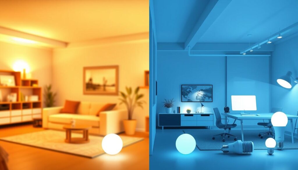
Ever thought about how lighting color can change a room’s feel? The right lighting can make a space both functional and beautiful.
Color temperature, measured in Kelvin (K), is key to picking the right light. It goes from warm, cozy tones to cool, focused ones.
Knowing the differences in color temperatures is vital. This guide will dive into cool white and warm white lighting. It aims to help you pick the perfect light for your home or office.
Key Takeaways
- Color temperature affects the ambiance and functionality of lighting.
- Understanding the differences between cool white and warm white lighting is essential.
- The right color temperature can enhance the aesthetic appeal of a space.
- Different lighting hues can impact focus, concentration, and coziness.
- Making informed decisions about lighting requires knowledge of color temperature.
Understanding Color Temperature in Lighting
The concept of color temperature is linked to the temperature of a black body radiator. It’s measured in Kelvin (K). This idea in lighting design changes how we see colors and the feel of a space.
What is Color Temperature?
Color temperature shows the color of light, from warm reds to cool blues. It describes the color of light from bulbs or other sources.
The Kelvin Scale Explained
The Kelvin scale measures color temperature. Lower temperatures (2000K-3000K) mean warm, yellowish light. Higher temperatures (above 5000K) mean cool, bluish light.
Historical Development of Light Temperature Standards
The idea of color temperature has grown a lot over time. It started with the color of a heated black body radiator. Now, it’s a key standard in the lighting world. Knowing its history helps us understand today’s lighting standards better.
In summary, color temperature is key in lighting. It affects how a space looks and feels. By knowing the Kelvin scale and light temperature history, we can choose better lighting for our needs.
Defining Cool White and Warm White
It’s important to know the difference between cool white and warm white lighting. This choice affects the mood and function of a room. The right color temperature is key.
Warm White: Characteristics and Kelvin Range
Warm white lighting creates a cozy and relaxing feel. It falls between 2700K and 3000K on the Kelvin scale.
2700K-3000K: The Cozy Spectrum
This warm white lighting is similar to old incandescent bulbs. It’s great for making living rooms and bedrooms feel warm and welcoming.
Cool White: Characteristics and Kelvin Range
Cool white lighting is bright and energizing. It’s best for areas where you need to focus. It ranges from 4000K to 6500K.
4000K-6500K: The Crisp Spectrum
In this range, cool white lighting is used in kitchens, offices, and reading spots. It provides a bright, focused light.
Neutral White: The Middle Ground
Neutral white lighting is around 3500K. It offers a balanced feel that’s not too warm or cool. It’s perfect for areas needing moderate brightness and color accuracy.
| Lighting Type | Kelvin Range | Characteristics | Ideal Use |
|---|---|---|---|
| Warm White | 2700K-3000K | Cozy, relaxing | Living rooms, bedrooms |
| Neutral White | Around 3500K | Balanced, moderate | General lighting, versatile |
| Cool White | 4000K-6500K | Crisp, energizing | Kitchens, offices, reading areas |
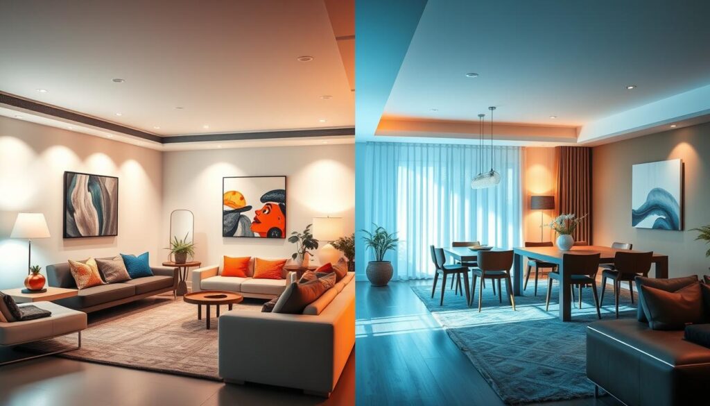
The Science Behind Light Color Perception
Seeing light colors is more than just the light itself. It’s also about how our eyes and brain understand it. This complex process involves the light’s physical properties and our biological response.
How Our Eyes Perceive Different Light Colors
Our eyes see different light colors based on light wavelengths. The human retina has cells that catch different wavelengths, showing us different colors. This is key to understanding how we see various light colors.
The Role of Wavelengths in Color Temperature
Color temperature is measured in Kelvin and is linked to light wavelengths. Warm white light has a longer wavelength, around 2700K-3000K. Cool white light has a shorter wavelength, above 3500K. The wavelength decides the color temperature, which affects how we see the light.
Color Temperature vs. Color Rendering
Color temperature shows the light’s warmth or coolness. Color rendering is about how well the light shows object colors. A high Color Rendering Index (CRI) means the light shows colors well. Knowing the difference between color temperature and color rendering helps pick the right lighting.
| Lighting Type | Color Temperature (K) | Color Rendering Index (CRI) |
|---|---|---|
| Warm White | 2700-3000 | 80-100 |
| Cool White | 3500-5000 | 80-100 |
| Daylight | 5000-6500 | 90-100 |
Cool White vs Warm White: Key Differences
Knowing the difference between cool white and warm white lighting is key. It helps create the perfect mood in any room. The right choice can change how a room looks and feels.
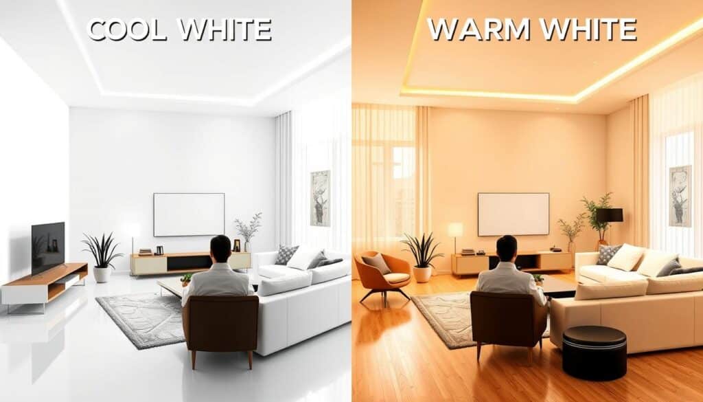
Visual Appearance Comparison
Cool white lighting looks bright and energizing, like a bluish-white. Warm white lighting, on the other hand, has a softer, yellowish glow. This makes it cozy.
Cool white lighting is great for places where you need to focus, like kitchens and offices. Warm white lighting is better for living rooms and bedrooms. It helps you relax.
Mood and Atmosphere Effects
The mood of a room can change with lighting color. Cool white lighting makes you more alert and awake. It’s perfect for places where you need to stay focused.
Warm white lighting, on the other hand, makes you feel calm and relaxed. It’s great for unwinding after a long day.
Practical Applications
The choice between cool white and warm white lighting depends on the room’s purpose. Cool white is best for task lighting. Warm white is better for creating a cozy atmosphere.
Task-Oriented vs. Ambient Lighting
Cool white is good for focused tasks like reading or cooking. Warm white is better for making a room feel welcoming. Mixing both can create a balanced lighting scheme.
Understanding the differences between cool white and warm white lighting helps you make better choices. It improves both the look and feel of your space.
Psychological Effects of Different Light Temperatures
Lighting affects our mood and behavior in big ways. Different light temperatures have unique effects on us. They play a key role in how we feel and act.
How Warm Light Affects Mood and Behavior
Warm light, with a lower Kelvin rating, makes us relax and feel less stressed. It’s perfect for cozy spaces like living rooms and bedrooms. The soft glow helps calm our minds and bodies, getting us ready for sleep.
Cool Light’s Impact on Alertness and Productivity
Cool light, with a higher Kelvin rating, boosts alertness and productivity. It’s great for workspaces and study areas. It helps us focus better and reduces eye strain.
Circadian Rhythm Considerations
Our bodies follow a natural rhythm that light affects. Warm light in the evening tells our body it’s time to sleep. Cool light in the day keeps us alert.
Using Light Temperature to Regulate Sleep Patterns
Adjusting light temperature can help our sleep patterns. Using warm light at night and cool light during the day keeps our rhythm healthy. This leads to better sleep and health.
In summary, knowing how light temperatures affect us helps us choose better lighting. The right light can improve our mood, productivity, and well-being.
Energy Efficiency Comparison
More people are thinking about the environment, which makes energy-efficient lighting important. The choice between cool white and warm white LEDs affects both the look of a room and how much energy it uses.
Do Cool and Warm Lights Differ in Energy Consumption?
The energy use of cool white and warm white lights depends on the technology, not just the color. LED technology makes lighting efficient, no matter the color.
LED Technology and Color Temperature
LEDs are made to save energy, and their energy use isn’t changed by color. Here’s a comparison of energy use in different LED lights.
| Lighting Type | Color Temperature (K) | Energy Consumption (W) |
|---|---|---|
| Cool White LED | 5000-6500 | 9 |
| Warm White LED | 2700-3000 | 9 |
| Neutral White LED | 3500-4100 | 9 |
Cost Analysis Over Time
LED bulbs might cost more at first, but they save money in the long run. A cost analysis over time shows LEDs are a smart choice, even with higher initial costs.
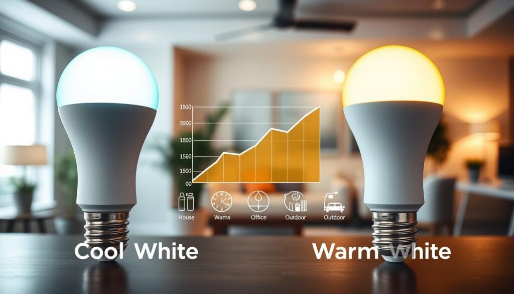
Lighting for Different Room Types
Different rooms in your home need different kinds of lighting. The right light temperature can make a room look better, work better, and even feel better. It’s all about creating the right mood and atmosphere.
Living Room Lighting Recommendations
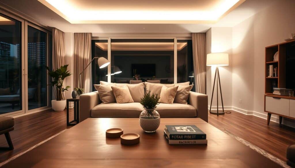
The living room is where you chill, have fun, and bond with loved ones. A warm white light (2700K-3000K) is perfect here. It makes the room feel cozy and welcoming. Use table lamps or floor lamps with warm shades to add depth to the lighting.
Kitchen and Dining Area Lighting
In the kitchen and dining, cool white light (3500K-4100K) is best. It’s bright and energizing, great for places where you do tasks. This light is perfect for countertops and dining tables.
Bedroom Lighting Solutions
Bedrooms are your own little world, where you want to relax. Warm white lighting (2700K-3000K) is best for a calm vibe. Dimmable lights are super helpful in bedrooms.
Bathroom Lighting Considerations
Bathrooms need special lighting. A neutral white light (3000K-3500K) is ideal. It’s clean and refreshing. Make sure there’s good task lighting around mirrors for grooming.
Home Office Lighting
For home offices, cool white lighting (3500K-4100K) boosts productivity. It’s important to avoid glare on screens and have enough light for reading and writing.
| Room Type | Recommended Light Temperature | Ambiance |
|---|---|---|
| Living Room | Warm White (2700K-3000K) | Cozy and Inviting |
| Kitchen/Dining | Cool White (3500K-4100K) | Bright and Energizing |
| Bedroom | Warm White (2700K-3000K) | Relaxing and Calming |
| Bathroom | Neutral White (3000K-3500K) | Clean and Refreshing |
| Home Office | Cool White (3500K-4100K) | Productive and Focused |
Commercial and Workplace Lighting Considerations
In commercial and workplace settings, lighting is key. It affects employee productivity, customer satisfaction, and business success. The right lighting can change a space’s ambiance and function.
Office Environments
Office lighting must focus on productivity and comfort. Productivity-focused lighting design uses various light sources. It aims to reduce eye strain and keep people alert.
Productivity-Focused Lighting Design
Offices need high illuminance levels for tasks that require focus. LED lighting with a high Color Rendering Index (CRI) is best. It offers clear, natural light that reduces eye strain.
| Lighting Type | Ideal Kelvin Range | Benefits |
|---|---|---|
| Cool White | 3500K-5000K | Enhances alertness and focus |
| Neutral White | 3000K-3500K | Provides a balanced lighting environment |
| Warm White | 2700K-3000K | Creates a cozy and relaxing atmosphere |
Retail Spaces
Retail lighting is vital for creating an inviting atmosphere. Strategic lighting design can highlight products and guide customers. It can also create visual interest.
How Light Temperature Affects Sales
The color temperature of lighting in retail spaces impacts customer behavior. Cool white lighting makes products appear vibrant and appealing. This can increase sales.

Hospitality Settings
In hospitality settings, lighting is key for a welcoming ambiance. Warm white lighting is often used. It creates a cozy and relaxing atmosphere.
Healthcare Facility Lighting
Lighting in healthcare facilities is critical for patient care. It should promote healing, reduce stress, and improve the patient experience. Using lighting with a high CRI can provide natural and clear light.
Lighting for Photography and Video
Lighting is key in photography and video. It greatly affects how good your images look. The right light can make your subject look better, set the mood, and change how people see it.
How Color Temperature Affects Image Quality
Color temperature changes how your photos and videos look and feel. Light sources have different temperatures, shown in Kelvin (K). Warm light (lower Kelvin values) makes things feel cozy. Cool light (higher Kelvin values) makes things look sharp and bright.
Choosing the Right Lighting for Different Subjects
Choosing the right light depends on what you’re shooting and what you want to show. Portraits look good with soft, warm light. Product shots need cool, crisp light to show details well.
White Balance Considerations
White balance is key to making colors look natural. It fixes the color of the light so your image doesn’t have color casts. Cameras have presets for common lighting, or you can adjust it yourself for more control.
Mixed Lighting Challenges and Solutions
Dealing with mixed lighting is a big challenge. When you have different lights with different colors, it can be tough. You can use lighting gels to match colors or adjust your camera settings. Or, use one light source to simplify things.
Understanding and controlling light can make your work much better. It helps create images and videos that grab attention and engage viewers.
Seasonal and Geographic Lighting Preferences
As we travel and experience different seasons, our lighting needs change. This change is due to cultural influences, where we live, and the time of year. These factors all play a role.
Regional Lighting Trends in the United States
In the United States, different areas have their own lighting styles. Warmer places like Florida like cooler lighting temperatures. On the other hand, colder places like New York prefer warmer tones. This shows how important it is to think about where you are when choosing lighting.
Adapting Lighting to Seasonal Changes
Seasons also change what we like in lighting. In winter, we often choose warmer lighting to feel cozy. But in summer, cooler lighting is better for a refreshing feel. This shows we need lighting that can change with the seasons.
Cultural Influences on Light Temperature Preferences
Cultural factors also shape our lighting choices. For example, warm lighting is often linked with welcoming in some cultures. But in others, cool lighting is seen as modern. Knowing these cultural differences helps us design lighting that suits everyone.
Health Considerations of Light Temperature
Light temperature affects our health in many ways, from sleep to eye health. Understanding how light impacts our well-being is key. Different light temperatures have unique effects on our health.
Blue Light Exposure and Sleep Quality
Blue light, found in cool white lighting, can disrupt our sleep. It lowers melatonin levels, which control our sleep-wake cycles. Reducing cool white lighting in the evening can help improve sleep.
Eye Strain and Visual Comfort
Long hours of certain lighting can strain our eyes. Warm white lighting, with its lower color temperature, is better for reading or working. Choosing the right light temperature can ease eye discomfort.
Long-term Health Impacts
Studies on light temperature’s long-term effects are ongoing. But, it’s clear that wrong lighting can harm our eyes and overall health.
Light Temperature for Aging Eyes
Our eyes become more sensitive with age. Warm white lighting is more comfortable for older people. It reduces glare and is gentler on the eyes. This is vital in homes and healthcare settings.
| Lighting Type | Color Temperature | Health Consideration |
|---|---|---|
| Cool White | 3500K-5000K | May interfere with sleep; can cause eye strain |
| Warm White | 2700K-3000K | Easier on the eyes; promotes relaxation |
Choosing the Right Bulbs and Fixtures
There are many lighting options out there. It’s important to know the differences between them.
LED Options
LED bulbs are very energy-efficient and last a long time. They come in different colors, from warm to cool white. This makes them good for many uses.
- Energy Efficiency: LEDs use much less energy than old bulbs.
- Longevity: They can last up to 25 times longer than incandescent bulbs.
- Design Flexibility: LEDs fit in many types of fixtures, from home lights to big displays.
CFL Considerations
CFLs, or Compact Fluorescent Lamps, are also energy-efficient. They use less power than incandescent bulbs and last longer.
- Eco-friendly: CFLs help reduce carbon emissions because they use less energy.
- Cost-effective: Even though they cost more at first, CFLs save money in the long run.
Halogen Alternatives
Halogen bulbs are a type of incandescent bulb with halogen gas. They give bright light and are often used for task lighting.
- Instant On: Halogen bulbs turn on right away, unlike some other bulbs.
- Dimmable: They can be dimmed, giving more control over the light.
Smart Lighting Solutions
Smart lighting systems let you control your lights in new ways. This includes changing colors and adjusting brightness.
Color-Changing and Tunable Options
These smart features let you change the light’s color and brightness. This can make your space feel different and more useful.
- Customization: You can change the light to fit your mood or activity.
- Energy Savings: Smart lighting can save energy by adjusting the light automatically.
When picking bulbs and fixtures, think about energy use, how long they last, and what you need for your space. Choosing the right ones can make your space better and more fun.
Color Rendering Index (CRI) and Its Importance
The Color Rendering Index (CRI) shows how well a light source shows colors. It’s key in judging lighting quality, as it checks if colors are shown right.
Understanding CRI Ratings
CRI scores range from 0 to 100. Higher scores mean better color showing. A perfect score of 100 is like natural daylight. Most places need a CRI of 80 or more for good color display.
How CRI Affects Color Perception
The CRI of a light greatly changes how we see colors. High CRI lighting makes colors look more alive and real. But, low CRI lighting can make colors seem dull or wrong. This is very important in places where colors must be exact, like art galleries and photography studios.
CRI Differences Between Cool and Warm Lights
Cool and warm white lights can both have high CRI. But, they show colors differently. Cool white lights bring out blues and greens. Warm white lights highlight reds and yellows. Knowing this helps pick the right light for different needs.
Practical Applications for High CRI Lighting
High CRI lighting is great in many places, like kitchens, art studios, and shops. It makes colors look better, improving both looks and use of these areas.
Common Misconceptions About Light Temperature
The world of lighting is full of myths, mainly about light temperature. Many people, even some experts, mix up light temperature with other lighting aspects. This leads to poor lighting choices.
Brightness vs. Color Temperature
Many confuse brightness with color temperature. Brightness is how bright the light is. Color temperature is about the light’s color, from warm (yellowish) to cool (bluish). People often think brighter lights are always cooler or dimmer lights are warmer. But, brightness and color temperature can be changed separately to get the right lighting.
Energy Efficiency Myths
Some think cool white lights use less energy than warm white ones. But, energy use depends on the light’s technology, not its color. LEDs, for example, save energy, whether they’re cool or warm.
One-Size-Fits-All Lighting Solutions
The myth that one lighting fits all is common. Different tasks, spaces, and tastes need different light temperatures. Warm white is cozy for living rooms, while cool white is better for kitchens or offices.
The “Natural Light” Confusion
Many think “natural light” always has the same color. But, natural daylight changes color throughout the day. It goes from warm reds at sunrise and sunset to cool blues at noon. Knowing this helps pick artificial lights that match natural light better.
Clearing up these myths helps people choose better lighting. This leads to more effective and pleasing lighting solutions.
Future Trends in Lighting Technology
The future of lighting is looking bright. Innovations like tunable white lighting and human-centric lighting are leading the way. These advancements are making lighting more than just a source of light. They’re creating spaces that improve our well-being and productivity.
Tunable White Lighting
Tunable white lighting lets users change the color of their lights. This is great for places like offices, where it can boost productivity or help relax. Tunable white LEDs offer a range of colors, from warm to cool.
Human-Centric Lighting Developments
Human-centric lighting helps our bodies stay in sync with nature. It mimics daylight to improve our health and alertness. This type of lighting is becoming popular everywhere, from homes to offices.
Smart Home Integration
Lighting is getting smarter, thanks to smart home systems. Now, you can control your lights with your phone or voice. Smart lighting solutions adjust based on time or if you’re home, saving energy.
Sustainable Lighting Solutions
Sustainability is a big deal in lighting now. The focus is on eco-friendly materials and saving energy. LED lights are a big part of this, using much less power than old lights. As we care more about the planet, sustainable lighting solutions will keep growing.
Conclusion
Knowing the difference between cool white and warm white lighting is key. This guide has covered the basics of color temperature. It shows how it affects mood, productivity, and the feel of a space.
When picking between cool white and warm white, think about the room’s purpose and feel. The right lighting makes any space better, whether it’s at home, work, or in a factory.
In the end, choosing between cool white and warm white lighting depends on many things. These include what you like, what you need to do, and the space’s design. This guide helps you pick lighting that looks good and feels right.
